
Data Exploration#
Our first step in the journey is reading and cleaning the data. We won’t focus too much on this step, because the really interesting stuff happens once we have the data loaded.
However, we will showcase how the data needs to be formatted for Gurobi. If this is your first pass of the case study, feel free to skip over this section and return to it later, when you want a more in-depth overview of how to format the data.
Environment Setup#
The fun always starts with importing packages.
import pandas as pd
import numpy as np
import plotly.express as px

import gurobipy as gp
from gurobipy import GRB
The next and final step in this section is to define what data we’ll be using to implement the solver, and in this case, we’ll be using real-world data from Madagascar. Madagascar is the fourth largest island in the world and is located off the southeastern coast of Africa. Known for its unique biodiversity, approximately 90% of its wildlife is found nowhere else on Earth. The island’s diverse ecosystems range from rainforests to deserts, making it a hotspot for biological research and conservation efforts.
However, Madagascar is also prone to natural disasters, including cyclones, floods, and droughts, all of which have a significant impact on its population and infrastructure. These disasters pose challenges for disaster response and resource allocation, making it an ideal case study for optimization and data-driven decision-making.
Reading and Cleaning#
Now we’ll load the data for a set of natural disasters and warehouses that will store supplies. One assumption made in this case study is that we do not have to worry about warehouse capacity.
While the data shows latitude and longitude of warehouse locations, these coordinates have been modified for safety purposes.
path = "https://raw.githubusercontent.com/Gurobi/gurobi-casestudy-esups/refs/heads/main/docs/"
disasters = pd.read_csv(path+"data/disasters.csv")
disasters.head()
| Type | Lat | Long | People Impacted | |
|---|---|---|---|---|
| 0 | Storm | -12.2667 | 49.2833 | 118000 |
| 1 | Storm | -14.2667 | 50.1667 | 100215 |
| 2 | Epidemic | -14.8762 | 47.9835 | 21976 |
| 3 | Epidemic | -15.7167 | 46.3167 | 15172 |
| 4 | Flood | -16.9504 | 46.8281 | 20000 |
warehouses = pd.read_csv(path+"data/warehouses.csv")
warehouses.head()
| Type | Lat | Long | Buckets | |
|---|---|---|---|---|
| 0 | Warehouses | -17.8237 | 48.4263 | 26 |
| 1 | Warehouses | -20.5167 | 47.2500 | 41 |
| 2 | Warehouses | -18.9085 | 47.5375 | 9046 |
| 3 | Warehouses | -17.3843 | 49.4098 | 2762 |
| 4 | Warehouses | -16.9167 | 49.9000 | 1682 |
Data Exploration and Visualization#
It’s always useful to see the general structure of data and the broader context of the problem. Now that we’ve cleaned and loaded it, let’s take some time to understand it. The goal here should be to get comfortable with the problem as a whole and give you an intuitive understanding of what we are solving. Therefore, the emphasis isn’t on the code; for this reason, most of the following cells have been written as functions to collapse more easily across different platforms. Your goal shouldn’t be to understand the libraries that are used to map, but on how Madagascar looks at a high level.
Where Is Everything?#
One of the first things we’ll look at is where the supplies are located relative to disasters right now.
dfw = warehouses[['Type', 'Lat', 'Long']]
dfd = disasters[['Type', 'Lat', 'Long']]

df_combined = pd.concat([dfw[['Lat', 'Long', 'Type']], dfd[['Lat', 'Long', 'Type']]], ignore_index=True)

fig = px.scatter_map(df_combined, lat="Lat", lon="Long",
                        color="Type",
                        color_discrete_sequence=px.colors.qualitative.Safe,
                        zoom=4.5)

# Use a minimalist map style to reduce clutter
fig.update_layout(map_style="open-street-map")
fig.update_traces(marker_size=10)

# Optionally center the map around the mean latitude and longitude of your points
mean_lat = df_combined['Lat'].mean()
mean_long = df_combined['Long'].mean()
fig.update_layout(map_center={"lat": mean_lat, "lon": mean_long})
fig.update_layout(margin={"r": 0, "t": 0, "l": 0, "b": 0})

fig.show()
We can see that the warehouses are aligned closely with the most prominent disaster sites*, so assuming they are built to a level that can survive and protect against those disasters, Madagascar should be in a strong position in terms of coverage. However, there’s more than meets the eye. Let’s dive a little deeper!
Hopefully, now that you’ve gotten a sense of the country and the layout, we’ll turn off some of the more detailed parts (such as roads and urbanization) so it’s simpler to see what’s going on.
What Supplies are Available?#
An important question to ask at this point is: What do we have inside the warehouses? It’s great that there seems to be good coverage that ensures a warehouse is nearby for any disaster that occurs on the island, but in the event of a flood, a warehouse full of kitchen sets might not be as immediately useful as one with buckets or tarpaulins. So, let’s look at the overall breakdown of supplies by warehouse/location:
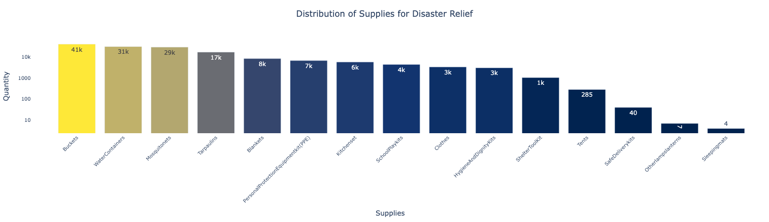
As we can see from above, the supplies skew heavily towards buckets, water containers, and mosquito nets, which makes sense for an island nation. But while it’s great that we have a lot of buckets, it won’t do us much good if none of them are near the coast, for instance.
From here out in the case study, we're going to focus on just buckets as they're the most prevalent item and, for the purposes of this case, it's time consuming and repetitive to analyze all 15 item types of supplies available. This case study assumes that it is sufficient to analyze each item independently.
Where Are the Supplies?#
Let’s take a look at the following map to get a better picture of where everything is.
supplies = pd.read_csv(path+"data/supplies.csv")
supplies.head()
| Lat | Long | Buckets | |
|---|---|---|---|
| 0 | -13.680400 | 48.455500 | 375 |
| 1 | -17.823700 | 48.426300 | 26 |
| 2 | -20.516700 | 47.250000 | 41 |
| 3 | -25.176133 | 46.089378 | 2322 |
| 4 | -18.908500 | 47.537500 | 9046 |
Here’s the code for this interactive map.
fig = px.scatter_map(supplies, lat="Lat", lon="Long", size="Buckets",
                       color_discrete_sequence=px.colors.qualitative.Safe,
                       zoom=4.5,  # Adjust zoom level as needed
                       )
# Optionally center the map around the mean latitude and longitude of your points
# Use a minimalist map style to reduce clutter
fig.update_layout(map_style="carto-positron")

mean_lat = supplies['Lat'].mean()
mean_long = supplies['Long'].mean()
fig.update_layout(map_center={"lat": mean_lat, "lon": mean_long})
fig.update_layout(margin={"r":0,"t":0,"l":0,"b":0})

fig.show()
We can see that the supplies are largely located on the eastern coastline of the country.
Not All Disasters Are Built the Same#
Let’s see which events Madagascar is more likely to encounter.
fig = px.scatter_map(disasters, lat="Lat", lon="Long", color="Type",
                        size="People Impacted",
                        zoom=4.5,  # Adjust zoom level as needed
                        color_discrete_sequence=px.colors.qualitative.Safe,
                        )

# Optionally center the map around the mean latitude and longitude of your points
# Use a minimalist map style to reduce clutter
fig.update_layout(map_style="carto-positron")

mean_lat = disasters['Lat'].mean()
mean_long = disasters['Long'].mean()
fig.update_layout(map_center={"lat": mean_lat, "lon": mean_long})
fig.update_layout(margin={"r":0,"t":0,"l":0,"b":0})

fig.show()
How Disasters and Supplies Compare in Scale#
You can see small blue circles within the red circles, representing supply quantities. The size of each red circle indicates the estimated number of people needing supplies in a disaster-affected area. Meanwhile, the blue circles show the total number of items available, adjusted based on how many people each item can serve. For example, one large bucket is estimated to meet the needs of 2.5 people, so the blue circles display the quantity of supplies as 2.5 * number of buckets.
dfs = supplies.copy()
dfs['Type'] = 'Supplies'
dfs['Scale'] = dfs['Buckets']*2.5

dfd = disasters.copy()
dfd['Scale'] = dfd['People Impacted']

df_combined = pd.concat([dfs[['Type','Lat', 'Long', 'Scale']],
                         dfd[['Type','Lat', 'Long', 'Scale']]],
                         ignore_index=True)

fig = px.scatter_map(df_combined, lat="Lat", lon="Long",
                      size="Scale", color='Type',
                      size_max=40,  # Maximum size of the marker
                      zoom=4.5,  # Adjust zoom level as needed
                      color_discrete_sequence=px.colors.qualitative.Safe,
                      )

# Optionally center the map around the mean latitude and longitude of your points
# Use a minimalist map style to reduce clutter
fig.update_layout(map_style="carto-positron")

mean_lat = df_combined['Lat'].mean()
mean_long = df_combined['Long'].mean()
fig.update_layout(map_center={"lat": mean_lat, "lon": mean_long})
fig.update_layout(margin={"r":0,"t":0,"l":0,"b":0})

fig.show()