
The Evolution of the Platform#
also for ensuring that the right information reaches the right people at the right time. In this section, we will explore the ESUPS website, which serves as a central hub for sharing critical data and insights with a diverse audience, including NGOs, government agencies, and the public.
The ESUPS STOCKHOLM platform is designed to translate complex optimization models and logistical data into intuitive, actionable information. Through a combination of interactive charts, maps, and data visualizations, the platform provides users with a clear understanding of where pre-positioned supplies are located, how they can be accessed, and the impact of various logistical decisions.
We will examine how ESUPS effectively communicates information about stock and analysis of results through STOCKHOLM, highlighting key features such as:
Real-time Data Visualizations: How ESUPS uses dynamic maps and graphs to show the distribution of resources and potential gaps in coverage. These are updated daily with the newest information available.
User-Friendly Interface: The strategies employed to make the website accessible and informative for both technical and non-technical users.
Impact Metrics: How ESUPS showcases the tangible benefits of its optimization strategies, including improved response times and resource utilization. We’ll take a special look at these later in the case to help us understand what our optimization techniques have achieved.
And finally, ESUPS has given us permission to share some of the difficulties they have experienced in their attempts to convey the scale of this problem, along with their findings and what they hope to improve for their users going forward.
Let’s take a look! The STOCKHOLM platform, where ESUPS hosts this model has two main pages. The first is the context page, which explains the context of the problem that we’ve been discussing throughout the past few sections, along with additional details about their mission and collaborating organizations. We’ll look at this one first!
Real-time Data Visualization with STOCKHOLM#
We’re going to take a slight detour here to look at how all this information is communicated in real life. As we’ve seen, getting an intuitive understanding of disasters and humanitarian supplies can be tricky when working within a new country. In fact, it’s one of the main challenges ESUPS has faced in driving adoption and explaining why their work is so important.
Data visualization isn’t an easy task, but let’s take a look at how ESUPS started and how they’re continuing to improve.
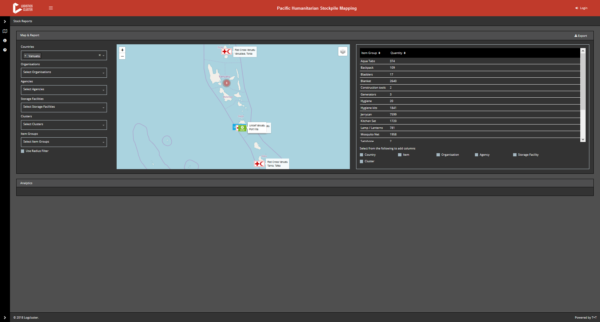
The earlier version of the ESUPS dashboard played a critical role in enabling the organization to quickly deliver a functional product that demonstrated tangible results to other nonprofits. This initial version provided the essential tools needed to map stockpiles and showcase the value of the platform in real-world scenarios. By prioritizing functionality and speed, ESUPS was able to meet the immediate needs of its partners, proving the concept and gaining crucial buy-in from stakeholders.
The dashboard’s ability to deliver key insights swiftly and effectively earned it significant merit, as it laid the groundwork for future improvements and set the stage for more advanced iterations. This approach underscores a vital lesson in development: sometimes, a good solution delivered quickly can be more valuable than a perfect one delivered too late.
The initial success provided a strong foundation upon which ESUPS could build. The insights gained from this deployment informed the development of a new version, which addresses the limitations of the first while enhancing user experience and data communication. The new dashboard takes these lessons to heart, incorporating more advanced features and a more intuitive design, ensuring that ESUPS continues to meet the needs of its partners more effectively. Now, let’s explore how this new version improves upon the original and further advances ESUPS’s mission.
Expanding STOCKHOLM’s Visualization Capabilities#
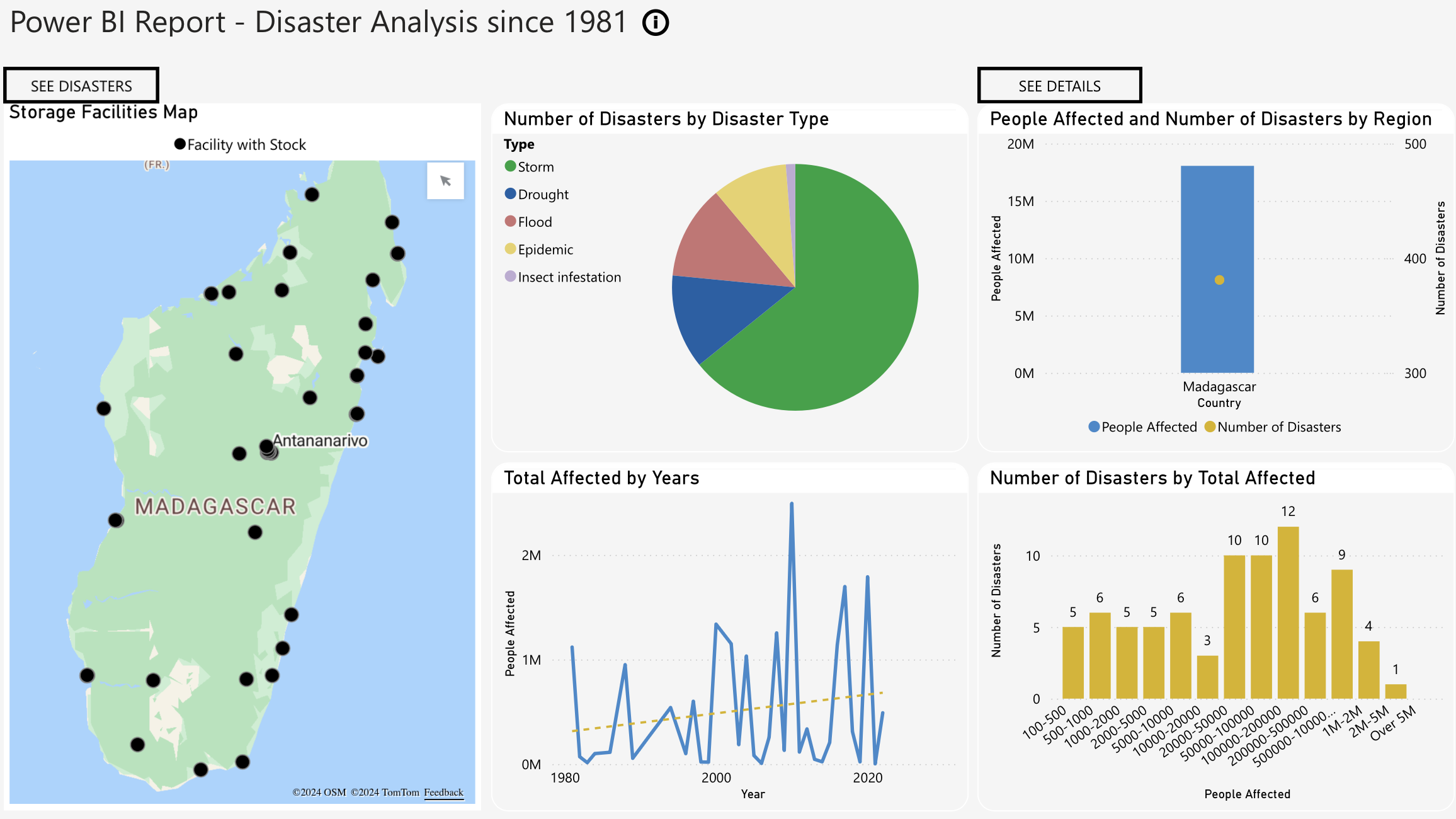
The newer version of the dashboard incorporates several effective design elements that help uninitiated users quickly grasp the context and understand the information presented. Building upon the foundation of the initial version, this iteration features a more logical layout, with distinct sections clearly labeled to make it easier for users to identify and comprehend different data categories at a glance. The use of diverse visualizations—such as a map, pie chart, bar chart, and line graph—enables multiple data points to be visualized simultaneously, offering a comprehensive overview of the situation.
A key improvement in this version is the effective use of white space. By strategically separating visual elements, the dashboard reduces clutter, ensuring that the information is not overwhelming and making it easier for users to digest. The clear representation of data ensures that each visualization has a specific purpose and is easy to interpret. For example, the Storage Facilities Map now clearly shows the geographical locations of storage facilities with available stock, providing important context. The pie chart uses distinct colors to differentiate between types of disasters, simplifying the interpretation of proportions, while the bar chart allows for a quick comparison of the number of people affected and the number of disasters by region. The line graph displays trends over time, with a dotted trend line to indicate the general direction of these trends.
The dashboard’s minimalist design elements further contribute to its effectiveness, another improvement from the earlier version. By avoiding unnecessary elements, the design minimizes distractions and enhances readability, ensuring that the focus remains on the data itself. Purposeful use of color now guides the viewer’s attention to key information more effectively. Interactive features, such as buttons labeled “SEE DISASTERS” and “SEE DETAILS,” allow users to engage more deeply with specific data points, which enhances both functionality and user engagement.
Moreover, the consistent color scheme and font style create a unified visual identity, lending a professional appearance and helping users navigate the information more intuitively. Altogether, these elements combine to present a cohesive design that significantly improves user experience and data comprehension compared to the earlier version.
However, as with any evolving tool, there is always room for further refinement. While this version addresses many of the initial challenges, the ongoing development process continues to identify areas where improvements can be made. By revisiting earlier designs, we can better understand how these refinements come about and how they contribute to a more effective and user-friendly dashboard. Let’s now take a look at one of the earlier pages to explore these opportunities for further enhancement.

As their dashboard continues to evolve, ESUPS is taking the opportunity to further enhance its intuitiveness and user-friendliness. Building on the successes and lessons from earlier iterations, the latest redesign aims to address some of the shortcomings that were identified in the previous versions. By incorporating clear labels, units, and detailed explanations, the new design strives to provide users with the necessary context to interpret data effectively. For instance, sections like “NATIONAL AND COLLECTIVE ASSESSMENT OF STOCK QUANTITIES” and “TIME GAINED BY RE-DISPATCHING ITEMS BETWEEN LOCATIONS” will benefit from added clarity, helping users to understand the information presented more intuitively.
One of the key areas for improvement in this redesign is the refinement of the color scheme. The use of distinct and contrasting colors will make it easier for users to differentiate between categories in the bar charts. Additionally, clearly indicating what each color signifies, as well as providing complete chart titles and fully displayed x-axis labels, will ensure that users can grasp the full context of the data being assessed. These visual enhancements are crucial for making the dashboard more accessible and easier to interpret, especially for users who may be less familiar with the underlying data.
Another critical improvement is the addition of context and explanations for key metrics. For example, providing details on figures like “39% - 14,615” under “National Stock Level Support” will remove ambiguity and highlight the relevance and importance of these numbers. Establishing clear connections between different data types—such as percentages, quantities, and time in minutes—will create a cohesive narrative that guides users through the data, making it easier to follow and more meaningful.
To further enhance the user experience, the redesigned dashboard will also focus on improving presentation aspects. Larger text sizes and decluttered visuals will enhance readability, allowing users to quickly grasp the information at a glance. Incorporating interactive elements, such as tooltips, will enable users to explore the data in greater depth and gain additional insights. Simplifying terminology and offering clear explanations for complex concepts, like “Time Gained by Re-Dispatching Items Between Locations,” will further aid in user understanding and ensure that the dashboard is accessible to a wider audience.
These iterative improvements are a testament to the dynamic nature of data visualization and communication within the industry. By continuously refining and enhancing the dashboard, ESUPS is committed to delivering a tool that not only meets but exceeds user needs. This ongoing process of iteration and enhancement underscores the organization’s dedication to creating a valuable resource for decision-making, ultimately helping ESUPS better serve its partners and fulfill its mission.